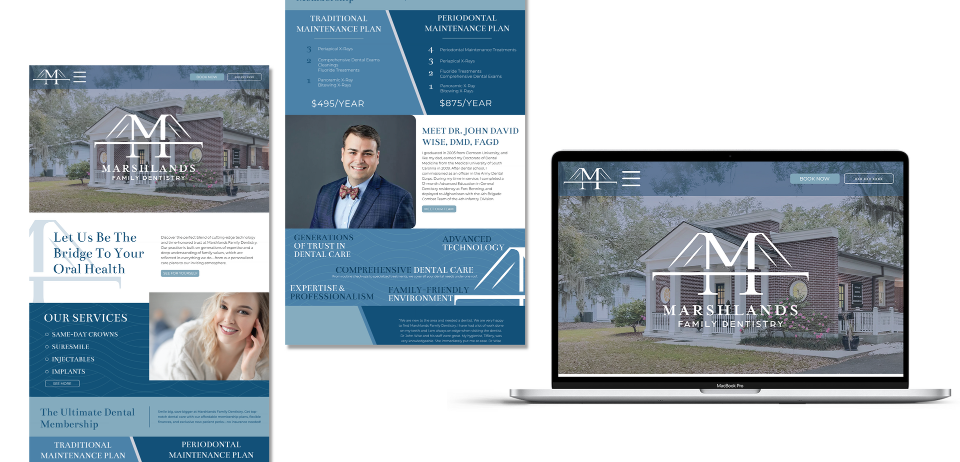
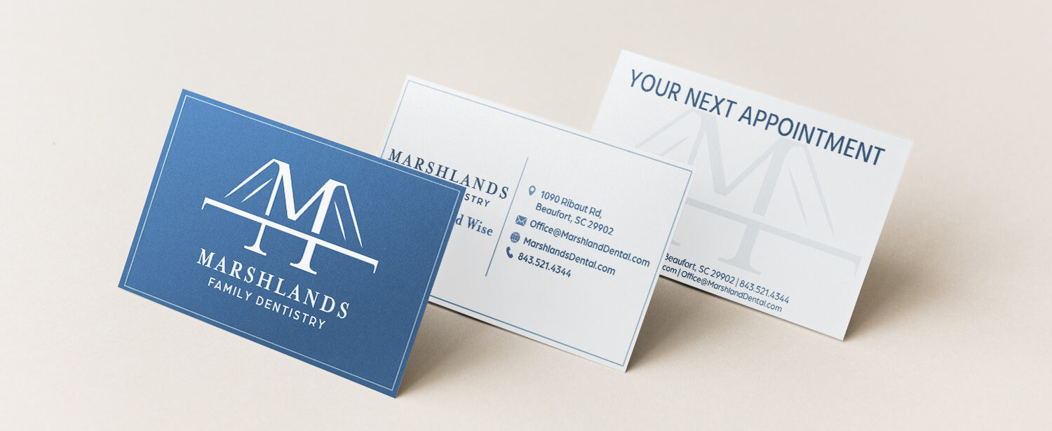
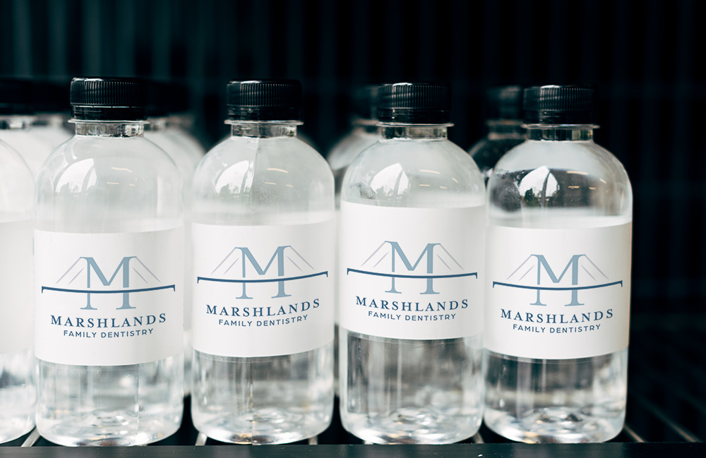
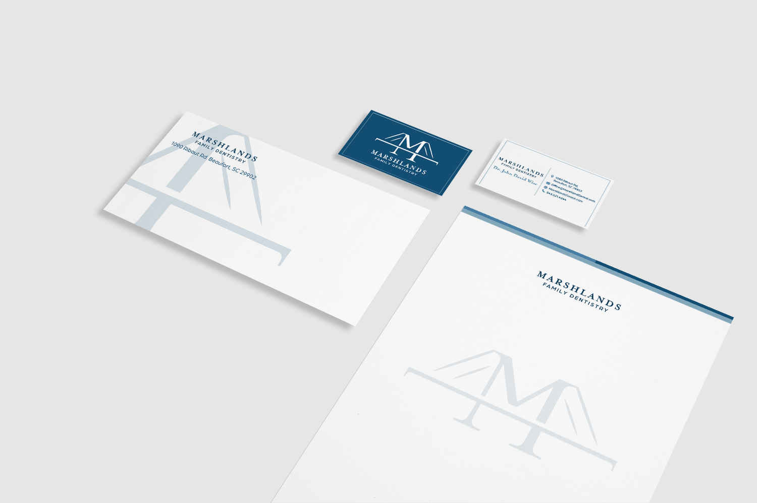
Located in the charming coastal town of Beaufort, South Carolina, Marshlands Family Dentistry is dedicated to providing top-notch, personalized dental care. To better reflect its commitment to modern, compassionate services, the office is refreshing its brand identity. This re-branding aims to create a welcoming atmosphere, enhance community visibility, and reinforce its reputation as Beaufort's premier dental care provider.
Fonts
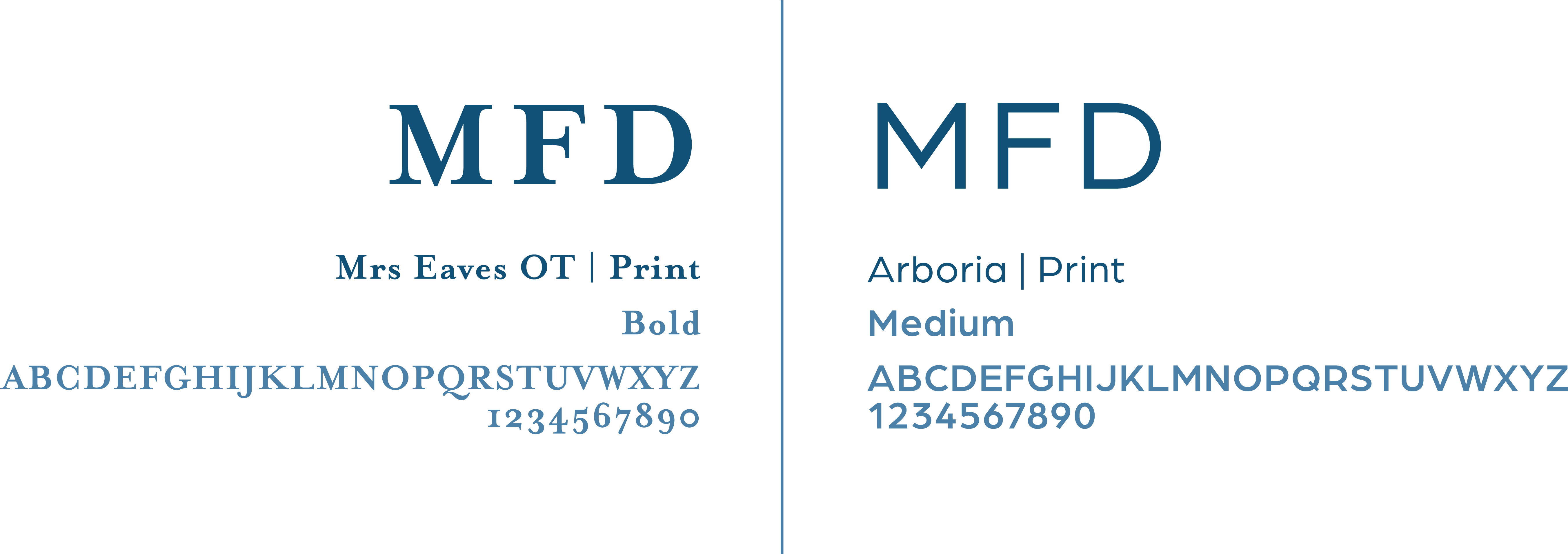
Use Mrs Eaves OT for all print headings and call-outs. The Mrs Eaves OT font has three type variations. The digital replacement font to use is Bentham.
Use Arboria as another option for all print headings, call-outs, sub-headings and body copy. This font has four type variations, use the other font variations to create type visual hierarchy. The digital replacement font to use is Montserrat.
Color Palette
Color compliments, builds, and personalizes a logo, without dictating the full design. Use these colors individually or together.
Primary colors can be used in all designs, so long as adequate contrast is used in conjunctions with the logos.
Secondary colors should be used sparingly and as accents when additional contrast is needed.
Neutral color can be used as an additional background color when black or white do not provide the desired effect.
The full black or white logo can be used against any of the primary colors as a background.

